Here’s a pretty basic css technique I’ve noticed myself using a lot of lately (not at all my own invention). The divs used as examples come from zen theme.
Often a design calls for putting a background (or border) on a sidebar. It should look as so:
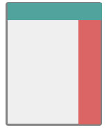
If you haven’t been down this route before, you will probably try something like
#sidebar-right{
  background: #123456;
}
As long as your sidebar is longer than your content you will think you have succeeded, but go to a page with long content and you will see:
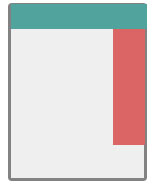
Argh! We want the sidebar background to go all the way down the page!
You’ve learned not to overthink when you’re dealing with css, so next you might decide to give the whole page the sidebar color and then give the content section its own background on top of that. This simply gives the opposite effect:
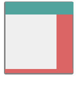
Now things only look right when the content is longer than the sidebar.
The easiest way to get things straight is to just suck it up and take it to Photoshop. Make an image with a 1px height and a width the same as your sidebar. Instead of applying the image as the background to your sidebar, you’ll apply it as the background to the whole page.
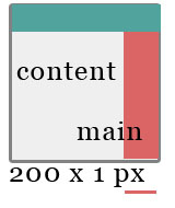
#main {
  background: url(images/sidebar.png) repeat-y top right;
}
If you have two sidebars, make one image the full width of the page.
Disadvantages:
You had to use Photoshop.
You can’t easily change your sidebar width.
You have to load one more image per page.
Advantage:
You’re done!
The same principle is very useful for theming panels. Panels are made up of one or more rows which each have one or more columns. Once you put content in the columns of varying height you get one ugly panel:
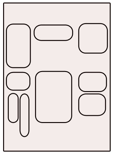
Do your panels kind of look like this too? Not good. This panel has two rows, and each row has 3 columns. Note that the second element in the second row’s first column (bottom left!) is actually a mini-panel containing two columns. Although the panel has a grid-like structure, the fact that all the content has varying heights makes it look like a mess and probably nothing like your designer’s mockup for your front page.
Adding backgrounds to the content will bring back order to the panel. But once again if you apply the background directly to columns you will end up with:
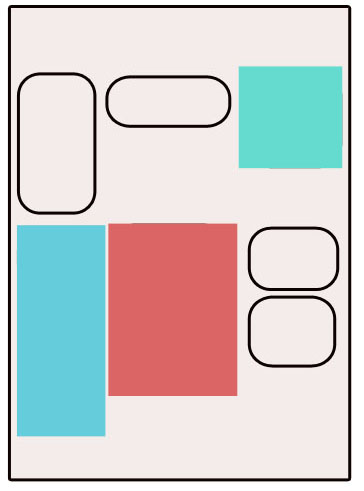
What you really want is more like:
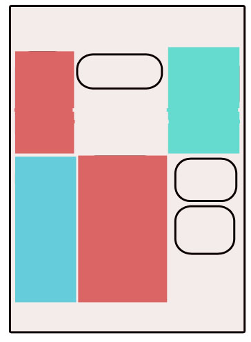
This is the kind of thing that I imagine was really easy back in the days of table-based layouts. Now that the web is all about dynamic content in divs of unpredictable heights, these kinds of things are more difficult. The answer is to, as in the sidebar example, create a background image for each row and tile it vertically.
Now your panels can have the tabled look they seem to be begging for and without the embarrassment of actually using tables! Does anyone have a preferable technique?

Comments
peach - alldrupalthemes (not verified) on March 12, 2008 - 5:43pm
Unfortunately this technique, called “faux columns”, is still the industry standard. In the (hopefully) near future we will be able to use display:table and display:table-cell to make divs behave like table cells and take a 100% height. Currently display:table is not fully supported by internet explorer <8.
Amitai (not verified) on March 13, 2008 - 10:29pm
But isn’t panels use tables in Explorer? In that case we can use your suggestion for non-explorer; and have _special_ CSS for explorer <8.
jody on March 13, 2008 - 10:35pm
Is this really the case in Panels 2? As far as I can tell, it’s not.
themegarden.org (not verified) on March 13, 2008 - 2:33am
Nice explanation, thanks.
ajayg (not verified) on March 15, 2008 - 10:21am
Nice and very useful article for folks like me who are non-designers.
Now if you two rows of panel (as you have above) with different background color, how you tile the background vertically? Certainly adding to #main won’t work. SO where I add the background: url(images/sidebar1.png) and url(images/sidebar2.png)
jody on March 15, 2008 - 1:02pm
Use Firebug to look for the appropriate panels row classes, for example .panel-row-1 or .panel-row-2.
.panel-row-1 {background: url(images/sidebar1.png) repeat-y;
}
.panel-row-2 {
background: url(images/sidebar2.png) repeat-y;
}
Martijn (not verified) on March 19, 2008 - 8:55am
Hi Jody,
This is very nice. Like color there are also other things that ruins the theming.
For instance the $tabs in my used theme takes the whole page, while I only want it to be on the panel (middle column of the page).
Is it with this sort of attributes the same as colors?